What is the first thing a potential client notices when they search for a coach? Your website. For many clients, your coaching website is their very first interaction with you, which means your coach website design plays a major role in shaping their impression of your credibility, professionalism, and style long before you speak to them.
Whether you are a life coach, executive coach, leadership coach, or career coach, your website should feel clear, inviting, and built to convert. A strong coaching website guides visitors effortlessly, explains what you do, and encourages them to take action. When your online presence feels confusing or outdated, you risk losing potential clients before you even get the chance to speak with them.
In this guide, you will learn what makes a great coaching website in 2026, how to design one without technical skills, what elements increase conversions, and what clients expect to see when they land on a coach homepage. You will also learn practical takeaways you can apply immediately, even if you do not have a full website yet.
Key Takeaways
- A coaching website is often the first impression clients have of you — make it professional, clear, and conversion-focused.
- Include a strong hero section, clear brand statement, and prominent calls-to-action to guide visitors effectively.
- Use professional photos, personality-driven content, and free resources to build trust and connection.
- Showcase social proof like testimonials, client transformations, and certifications to boost credibility.
- Organize your site with a simple, intuitive structure that highlights services, programs, and next steps.
- Learn from proven examples of successful coaching websites to apply layouts, funnels, and design strategies.
- Platforms like Simply.Coach can help create a polished, conversion-ready landing page while streamlining your coaching workflow.
Why Strong Coach Website Design Matters
A well designed coach website is more than a digital business card. It influences how potential clients perceive your expertise, feel your credibility, and decide whether to work with you. When someone lands on your site, they are silently evaluating your professionalism, your clarity, and the value you bring to their life or business.
A strong coach website builds trust by showing visitors what you do, who you help, and how your coaching creates change. It also guides users in a smooth and intuitive way so they understand your services, explore your story, and take the next step toward booking a session.
Here are the key benefits of investing in strong coach website design:
- Helps potential clients understand your value quickly
- Improves first impressions and builds instant trust
- Makes your services easier to explore and compare
- Creates a smooth pathway toward booking a call or session
- Highlights your credibility through social proof and clear branding
- Works as a 24/7 representative of your coaching practice
In this guide, you will discover the core elements that make a coach website successful and explore real examples that show how strong design and clear positioning inspire visitors to take action.
What Should a Coach Website Include? Essential Elements for 2026
Now that you understand why strong coach website design matters, the next step is knowing exactly what to include in a modern, conversion-focused coaching website. Whether you are a life coach, executive coach, business coach, or wellness coach, the following elements help your website build trust and turn visitors into clients.
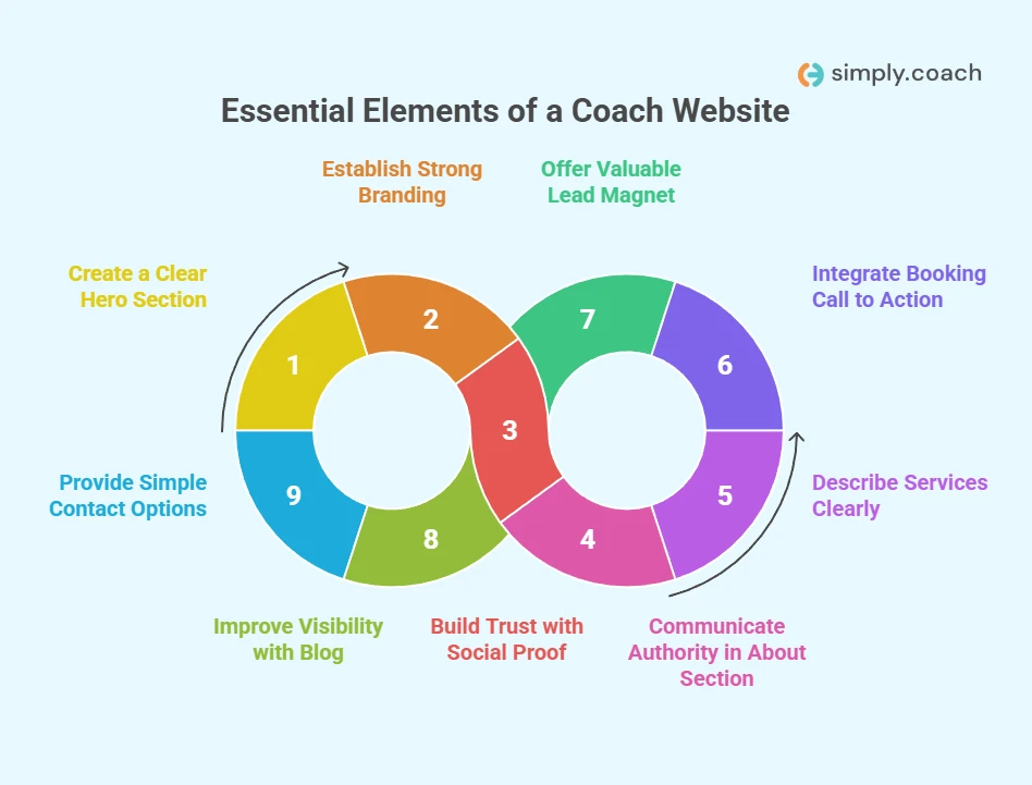
1. A clear hero section that highlights your transformation
Your hero banner should explain who you help, what transformation you provide, and include a direct call to action such as “Book a discovery call” or “Get started.”
2. Strong and consistent branding that reflects your identity
Your colors, typography, imagery, and brand tone should match the personality of your coaching style, whether calming, premium, bold, or energetic.
3. Social proof that builds trust quickly
Testimonials, transformation stories, certifications, and client logos reassure visitors that your coaching delivers results.
4. An about section that communicates authority
Share your coaching philosophy, experience, approach, credentials, and what makes your method effective and unique.
5. Clear descriptions of your services or signature programs
Explain what you offer, how your process works, and what clients can expect. Pricing is optional but transparency improves conversions.
6. A prominent booking call to action that encourages action
Integrating a scheduling tool such as Simply.Coach helps clients book sessions instantly without back-and-forth communication.
7. A valuable lead magnet that grows your email list
A free guide, assessment, or short training can help you capture leads and nurture potential clients with ease.
8. A blog or resources area that improves visibility
Publishing insights and guides strengthens your authority and improves both SEO and AEO visibility across search engines and LLM platforms.
9. Simple and accessible contact options
Provide a quick way for prospects to reach you through a form, email, or chat widget so they never hesitate to get in touch.
Want to see these principles in action?
Check out the Simply.Coach Showcase Page, which acts like a polished, branded landing page.

12 Best Coaching Website Design Examples to Inspire Your Own Site
A great way to improve your own coaching website is to study how successful coaches structure theirs. Clear examples help you see how design, storytelling, and funnel logic work together to build trust and guide potential clients toward taking action. When you look at websites that already convert well, you start to understand what creates authority, what strengthens your message, and what turns curiosity into committed clients.
The following examples give you a practical reference you can use to shape a coaching website that feels credible, intentional, and aligned with your brand.
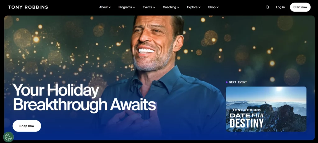
1. Tony Robbins— Leadership and High Performance Coaching
Who it is for
If your practice serves executives, entrepreneurs, or high-performance clients, this is a model for creating a commanding online presence that supports event funnels, high-ticket programs, and assessment-driven lead capture.
Key design elements
- High-energy hero with bold headline and dramatic imagery
- Multiple conversion entry points: events, assessments, programs
- Prominent trust indicators such as client logos and success stories
- Dynamic sections that highlight events and signature programs
Why it works
The design immediately signals scale and authority. People landing on the site quickly understand the breadth of offerings and can enter different parts of the coaching funnel depending on their intent. The large, benefit-driven headlines and clear CTAs reduce friction for visitors who are ready to buy or to explore via an assessment or event registration.
What you can adapt
- Lead with a powerful value headline that matches your coaching promise
- Offer more than one funnel path: a free assessment, an event sign-up, and a discovery call
- Use social proof prominently to speed trust building
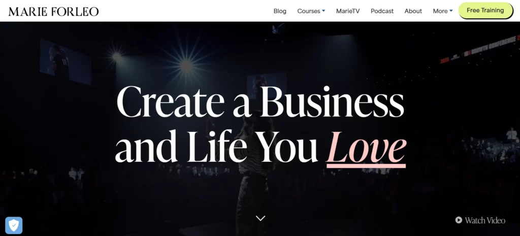
2. Marie Forleo— Personality-Driven Business and Life Coaching
Who it is for
This layout is ideal when your main marketing lever is content and personality. Coaches who teach through video, courses, and web-series will find this approach especially useful.
Key design elements
- Video-first hero or featured content area
- Clear content-to-offer journey (video → newsletter → course)
- Consistent brand voice that reads like a conversation
- Focused navigation prioritizing courses and free resources
Why it works
Placing video and short-form content at the center lets prospects sample your coaching voice immediately. That builds rapport faster than text alone and primes visitors to opt into lead magnets or paid courses. The content funnel is straightforward: generous free content leads to email capture, which then feeds paid offers.
What you can adapt
- Add a short 60–90 second hero video that illustrates your coaching style
- Create a content-to-offer path: free video → lead magnet → paid program
- Keep navigation simple so content drives conversions rather than distracts
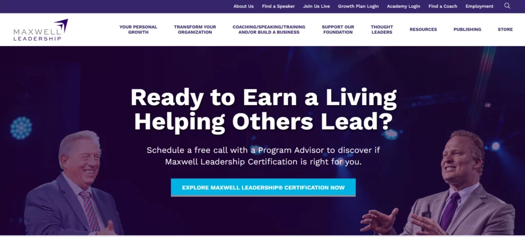
3. John Maxwell— Leadership Development and Resource-Driven Coaching
Who it is for
If your coaching is content and resource heavy, and you target corporate or team clients, this model shows how to use a resource library and long-form assets as lead drivers.
Key design elements
- Deep resource archives: articles, tools, and downloads
- Certifications and institutional credibility clearly displayed
- Program pages created for corporate buyers and coaches
Why it works
Corporate and executive buyers need evidence and depth before engaging. A content-rich site supports organic search visibility and feeds a coaching funnel that moves from free tools to paid workshops and long-term contracts. The site functions as both a marketing engine and a credibility hub.
What you can adapt
- Build a compact resource hub with downloadable tools that act as lead magnets
- Use longer articles to rank for transformation coaching and leadership keywords
- Provide clear program options for individual vs corporate buyers
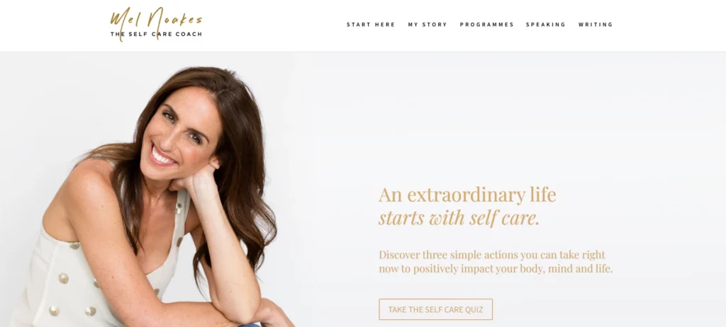
4. Mel Noakes— The Self Care Coach
Who it is for
This example is useful if you coach women on wellbeing, work-life balance, body image, or working with habitual behaviour change. Mel’s site shows how to serve an audience that needs both emotional reassurance and clear steps to change.
Key design elements
- Friendly, professional photography that puts the coach front and centre
- Multiple lead capture points including a self-care quiz, email pop-up, and book promotion
- Clear programme structure for one-to-one coaching, retreats, and corporate work
- Prominent book and speaking credentials used as trust signals
- Clean layout with focused calls to action that do not overwhelm the visitor.
Why it works
Mel’s site balances warmth with practical offers. The photography and copy create immediate rapport while the layered lead magnets let visitors choose how much they want to engage. That combination increases both initial opt-ins and deeper conversions such as book sales or coaching enrolments. The visible products and speaking work also reinforce authority and broaden marketing channels.
What you can adapt
- Add a short quiz or self-assessment to qualify and engage visitors quickly
- Promote a low friction product such as a book or workbook to establish authority and earn trust
- Place multiple, distinct lead capture options so visitors can convert at different intent levels
- Use warm, personality-forward photography to build connection immediately
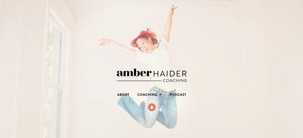
5. Amber Haider— Personal Brand with a Unique Metaphor (Ballroom Mindset)
Who it is for
This structure works well for coaches who have a strong personal story or niche metaphor that makes their brand memorable.
Key design elements
- Distinctive color palette and imagery tied to the coach’s personal story
- Story-first about section that explains the origin of the methodology
- Podcast episodes, blog content, and signature workshops surfaced prominently
Why it works
Using a unique metaphor such as ballroom mindset creates instant recall and helps prospects form an emotional connection. That connection improves conversion because people not only like the idea of transformation, they also remember the narrative and brand.
What you can adapt
- Build a short origin story that connects your identity to your method
- Pick a bold, consistent color system that supports brand recall
- Surface podcast or video content as proof of presence and authority
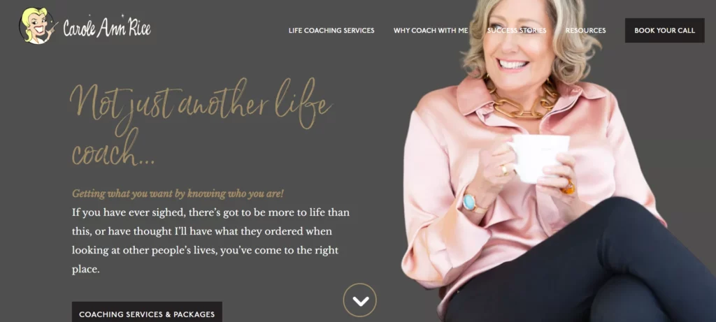
6. Carole Ann Rice— Premium Local Life Coaching
Who it is for
Coaches who serve local markets or premium clientele will find this format useful because it blends local trust signals with a refined visual style.
Key design elements
- Polished gold and black palette for premium feel
- Local trust signals such as region-specific testimonials and training accreditations
- Strategic pop-ups or newsletter CTAs that are timed, not intrusive
Why it works
Local clients often want to see professional polish and social proof that indicates a coach has credibility in the local context. Well-timed lead capture plus elegant visuals position the coach as both trustworthy and high-value.
What you can adapt
- Display local testimonials and affiliations prominently
- Use subtle pop-ups or slide-ins for a well-timed lead magnet
- Apply a refined color palette to attract premium prospects
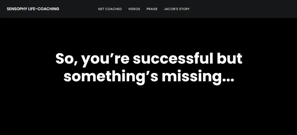
7. Sensophy— Minimalist Life and Career Coaching
Who it is for
This example is well suited to coaches offering hybrid services like career coaching plus breathwork or wellness modalities.
Key design elements
- Minimal, low-distraction layouts and calm imagery
- Clear separation of service types so users can choose their path easily
- Brief, benefit-driven copy with easy navigation to service pages
Why it works
Minimal design reduces cognitive load for visitors who may be stressed or uncertain. Presenting services in distinct buckets helps build a neat coach website funnel: explore → choose modality → book intro. This is highly effective for coaches mixing modalities such as coaching and breathwork.
What you can adapt
- Use whitespace and concise copy to reduce overwhelm
- Separate multi-modality services into discrete pages
- Feature calming imagery to reinforce your wellness brand
8. Michael Serwa— Elite High-Performance & Life Coach
Who it is for
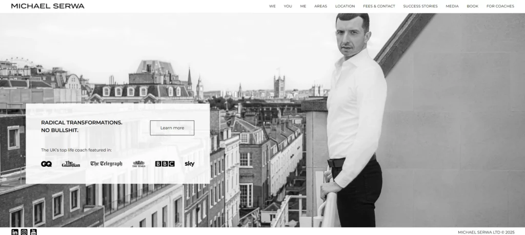
This model is ideal if you coach high-achievers, such as CEOs, entrepreneurs, and senior professionals, who want direct, no-nonsense guidance. Serwa’s clients prioritize results, honesty, and accountability over feel-good platitudes.
Key design elements
- Clean, powerful visuals with a bold headline that communicates elite-level coaching
- Clear, conversion-focused structure: high-ticket one-to-one coaching, no group calls or scaled programs
- Lead capture via direct “work with me” messaging that highlights his signature style and audience
- Trust signals: media coverage (GQ, The Times), his book, and top-tier client testimonials
Why it works
Serwa’s website reflects his coaching philosophy, exclusive, high-stakes, and deeply accountable. The design underlines his premium positioning, while his messaging attracts only those serious about transformation. His “truth-first” style sets him apart and builds strong alignment with clients who value real challenge and growth.
What you can adapt
- Position your coaching offer for high performers who demand results, not comfort
- Use scarcity and exclusivity (limited client slots) to reinforce value
- Be very clear about results, investment, and commitment required
- Include strong proof via media, client achievements, or a published book
9. Samantha Siffring— Business Coach for Moms
Who it is for
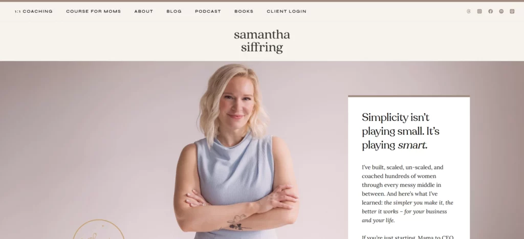
This example is perfect if your coaching targets moms, solopreneurs, or early-stage business owners who want practical guidance without complexity. Her website style suits coaches who prefer clarity, warmth, and community-driven messaging over flashy branding.
Key design elements
- A clean, minimalist layout focused on readability and emotional relatability
- Warm, friendly visuals that instantly communicate safety and support
- Clear, linear funnel leading to coaching programs, podcasts, and community offers
- Simple copy that removes jargon and speaks in a direct, conversational style
- Social proof through client wins, testimonials, and community success stories
Why it works
Samantha’s website hooks visitors by speaking directly to a very specific audience — moms growing businesses while managing family life. The simplicity removes cognitive load and builds immediate trust. Her messaging highlights real results, approachable support, and a community-driven success path.
What you can adapt
- Narrow your messaging to a very specific audience and speak directly to their real-life challenges
- Use clean, clutter-free layouts that make navigation effortless
- Show relatable client wins and community stories instead of generic testimonials
- Keep your copy warm, human, and supportive rather than overly polished
10. Kara Gaisie— Coach for High-Achieving Professionals Turning Their Careers Around
Who it is for
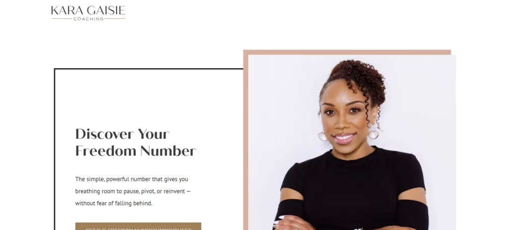
This example is for coaches who serve high-earning professionals, especially women ready to leave secure six-figure jobs to build a coaching business on their own terms. Her audience includes people who value financial stability and transformation, but want to create meaningful work without losing their lifestyle.
Key design elements
- Direct, emotionally honest homepage that sets up the transformation from corporate career to coaching business
- Lead magnet tools like a quiz or “I bet on myself” messaging to capture ideal clients
- Clear coaching programs for 1:1 coaching, career transition, and business coaching. Trust signals from her CPA background, her own transition story, and glowing testimonials
- A strong call-to-action centered on leaving a six-figure job and building sustainable coaching income
Why it works
Kara’s website resonates because she speaks directly to professionals who are confident, capable, but unfulfilled. By combining financial clarity (CPA) with a clear coaching path, she builds trust and positions herself as a real-life example of the transformation she offers. Her funnel strategy (quiz, coaching, 1:1) helps qualify serious clients.
What you can adapt
- Position yourself as someone who understands both business and deep transformation
- Use a quiz or self-assessment as a lead magnet tied to financial mindset or business vision
- Make your “work with me” messaging bold and aspirational, focusing on career-to-coach transition
- Use your professional background or story as proof of commitment and credibility
11. Mel Robbins— Practical Tools and Habit-Based Coaching
Who it is for
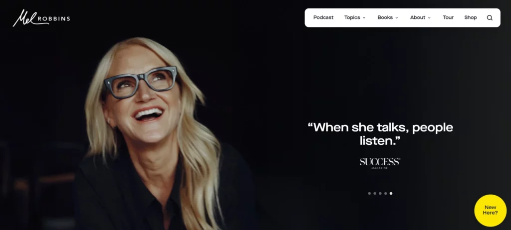
Coaches who emphasize practical tools, daily habits, and evidence-based tactics will learn from this hands-on, productized approach.
Key design elements
- Practical, tool-driven resources like workbooks and short courses
- High-volume content distribution (podcast, social, video) feeding into resource funnels
- Clear product funnels from free resource to paid course or coaching
Why it works
Practical tools lower the activation energy for prospects. When a visitor can use a workbook or short tool immediately, trust builds quickly and conversion into paid programs becomes easier. The content funnel keeps prospects engaged over time and moves them toward deeper commitments.
What you can adapt
- Create short, practical workbooks or mini-courses as lead magnets
- Use everyday tools to demonstrate quick wins and drive trust
- Channel podcast and social traffic into resource funnels that nurture prospects
13. Vishen Lakhiani– Mindvalley Coach Ecosystem
Who it is for
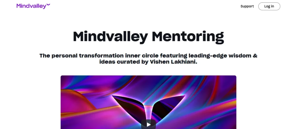
This example is ideal if you’re building a transformation coaching brand or designing a premium group coaching experience. Coaches who rely on structured pathways, multi-stage funnels, and content-led authority can learn a great deal from Mindvalley’s ecosystem. If scaling your practice globally or positioning yourself within a high-end personal growth category is your goal, this model offers one of the strongest blueprints.
Key design elements
- A cinematic hero banner that immediately establishes authority with well-known experts and global reach.
- A deep-scroll design that reveals the transformation journey in a narrative, sequential format.
- A strategic funnel structure built around free masterclasses that nurture cold audiences into course or membership enrollments.
- Bold, modern visuals supported by clean type and personality-rich branding.
Why it works
Mindvalley’s website isn’t just visually impressive. It is engineered with behavioral psychology and conversion design. Every scroll adds clarity, emotional depth, or social proof. Visitors move through a guided journey, curiosity, engagement, trust, and then commitment. The blend of video storytelling, transformation case studies, and authoritative branding makes this website feel premium from the very first second.
What you can adapt
- Reframe your core program into a structured “pathway” rather than a list of services.
- Use a free masterclass or assessment as your primary lead magnet to warm up new visitors.
- Add a clear transformation narrative that shows what changes your clients can expect from working with you.
By studying these diverse, high-converting coaching website designs, you’ll have a clear understanding of what elements to apply to your own site, helping you create a polished, trustworthy, and conversion-ready coaching website that reflects your brand and drives consistent client inquiries.
Also read: Best Website Builders and Platforms for Coaches in 2025
7 Practical Tips to Build a High-Performing Coaching Website that Wins Clients
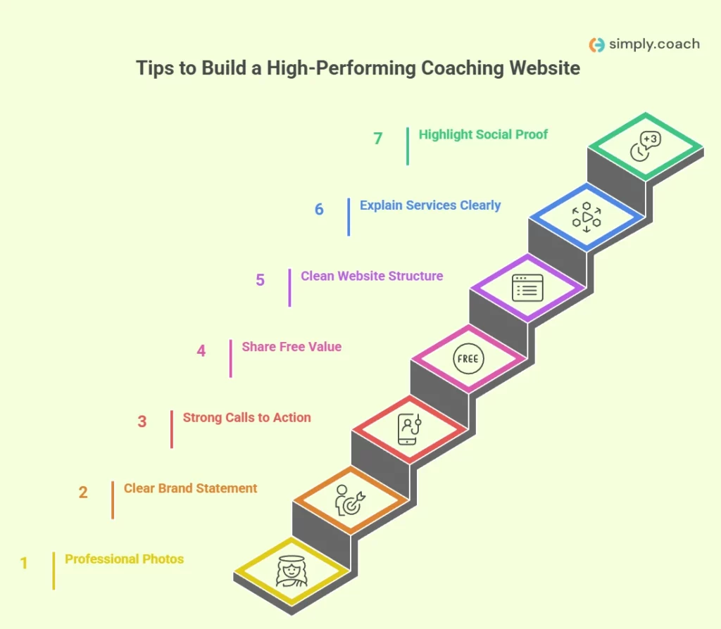
Creating a coaching website that actually converts starts with clear communication, intentional design, and content that addresses potential clients’ search queries. Your site should help visitors understand what you do, how you help, and why you’re the right choice, without making them hunt for information.
Each of the tips below is designed to improve search visibility, build trust, and give clients the clarity they need to confidently move toward working with you.
1. Invest in professional, personality-driven photos
High-quality photos help visitors understand the person behind the coaching practice. These images create connection, build trust, and set the emotional tone for your brand.
Examples:
- A warm, confident headshot with natural light
- A candid coaching-style photo showing you working with a client or journaling your process
2. Craft a clear and memorable brand statement
Your brand statement should instantly communicate who you help and the transformation you provide. A precise statement reduces friction and encourages visitors to stay on the page.
Examples:
- “I help mid-career professionals build confidence and transition into meaningful leadership roles.”
- “Supporting women entrepreneurs who want clarity, focus, and sustainable growth.”
3. Use strong calls to action to guide clients
Your website should make the next step obvious. Strategic placement helps ready-to-act visitors convert quickly.
Examples:
- Primary CTA: “Book a free discovery call” in the hero section
- Secondary CTA: “Explore my coaching programs” placed mid-page
4. Share free value to build trust
Free resources give potential clients an easy way to experience your approach. They also improve LLM visibility by creating more surface area for search and answers.
Examples:
- A downloadable goal-setting worksheet
- A short video explaining your coaching method
5. Create a clean, client-friendly website structure
A clutter-free layout builds credibility and helps visitors find what they need in seconds. Your core pages should feel simple, organized, and aligned with your brand.
Examples:
- A services page with clear program names and short benefit-driven summaries
- A blog categorized by themes clients often search (confidence, relationships, leadership, habits, etc.)
6. Explain your services with complete clarity
Clients should understand what you offer, who it’s best for, and what outcomes they can expect before they reach out.
Examples:
- List inclusions such as number of sessions, tools, or assessments
- “This program is ideal for…” sections that match client search intent
7. Highlight social proof and transformation moments
Proof builds trust and shows what change looks like through real client experiences.
Examples:
- A testimonial with a specific outcome (“I landed a new job within 3 months…”)
- A before-after transformation story or client case study
Quick checklist for coaches
- Do your photos reflect your personality and coaching style?
- Is your brand statement specific and outcome-focused?
- Does your hero section include a clear call to action?
- Are you offering at least one valuable free resource?
- Is your website structure clear and easy to navigate?
- Are your services explained with defined outcomes?
- Have you added testimonials or transformation proof?
When these practices come together, your website becomes more than a digital brochure, it becomes a trusted space that reflects your expertise, attracts the right clients, and supports them in taking the next confident step toward working with you.
Also read: SEO Tips for Increasing Organic Traffic to Your Coaching Website
Conclusion
A well designed coaching website is often the first step in helping potential clients understand your value, your process, and the transformation you offer. When your digital presence is intentional and clear, it becomes far easier for visitors to trust you, explore your services, and take the next step. Strong messaging, clean structure, and meaningful social proof all work together to turn your website into a consistent source of qualified clients.
If you want to improve your online presence while also managing every part of your coaching practice in one place, Simply.Coach gives you the complete toolkit. It is an all in one coaching platform built to support the entire client journey. You get scheduling, billing, client notes, assessments, goal tracking, progress reviews, group programs, digital forms, session management, and powerful automation, all within a single software, that saves hours every week.
What’s more, the Showcase Page helps you present your coaching profile in a polished, conversion ready format so prospects can clearly understand your expertise and efficiently schedule appointments.
FAQs
1. What should a coaching website include to attract more clients?
A strong coaching website needs a clear brand statement, clean navigation, social proof, and compelling CTAs. Adding a valuable lead magnet helps convert visitors into warm leads.
2. How do I build trust on my website if I am a new coach?
Share your story, philosophy, certifications, and testimonials from early or beta clients. Consistent free content also builds credibility quickly.
3. Should coaches display pricing on their website?
Showing prices improves transparency, while discussing them during calls gives you space to explain value. Choose based on what your audience prefers.
4. What is the most important part of the coaching homepage?
The hero section matters most because visitors decide within seconds if you are the right fit. It should clearly express who you help, the outcome you offer, and the next step.
5. How can I improve my coaching website’s discoverability?
Publish consistent free value like blogs or videos to expand keyword coverage and topical authority. Well structured pages and internal links also support higher visibility.
6. What tools do coaches need to manage clients effectively online?
Most coaches need scheduling, notes, invoicing, goal tracking, and secure communication. Platforms like Simply.Coach combine all of this in one streamlined system.
7. Do I need a full website to start getting coaching clients online?
Not always. A polished landing page like Simply.Coach’s Showcase Page can attract clients quickly while offering booking, tracking, and client management features.
About Simply.Coach
Simply.Coach is an enterprise-grade coaching software designed to be used by individual coaches and coaching businesses. Trusted by ICF-accredited and EMCC-credentialed coaches worldwide, Simply.Coach is on a mission to elevate the experience and process of coaching with technology-led tools and solutions.
